1. Getting Started with vuSmartMaps™
3. Console
5. Configuration
6. Data Management
9. Monitoring and Managing vuSmartMaps™
Dashboards are powerful tools that provide visual representations of data, making it easier to analyze and understand complex information. Dashboard is a collection of panels organized in rows. Each panel is a visualization unit with its own data query editor. This editor is tailored to the panel’s chosen data source, helping you create the right visualizations.
![]()
Dashboards make it easy to build the perfect view. You can create queries, adjust visuals, and craft the ideal dashboard. Every panel can pull data from any configured source. However, dashboard snapshots are fixed. Changes to queries won’t update snapshot data since snapshots can’t re-run queries. For instance, if you wish to gain insights into your business journey, you can create a dashboard that incorporates various panels to offer comprehensive observability into the business journey.
![]()
![]()
![]()
Dashboards serve as powerful tools for visualizing data and uncovering patterns or irregularities that contribute to faults or low performance. When faced with a system failure, simply examining the raw numbers may not provide a clear understanding of the root cause. This is where the charts, graphs, and visuals on the dashboard play a crucial role in helping us identify and address the underlying issues more effectively.
![]()
Here are the main advantages of a Dashboard in vuSmartMaps™.
![]()
![]()
![]()
Apart from that, Dashboards also offer multiple applications such as:
![]()
![]()
![]()
Dashboard offers comprehensive insights into IT infrastructure health and performance. Any abnormalities or potential bottlenecks are immediately flagged, enabling you to proactively identify issues before they impact our operations.
![]()
![]()
![]()
In summary, this powerful dashboard revolutionizes the way you manage your IT infrastructure, providing real-time insights, proactive alerts, historical data analysis, and efficient troubleshooting capabilities. It ensures uninterrupted operations and empowers your IT team to optimize system performance, contributing to the success of your organization.
![]()
![]()
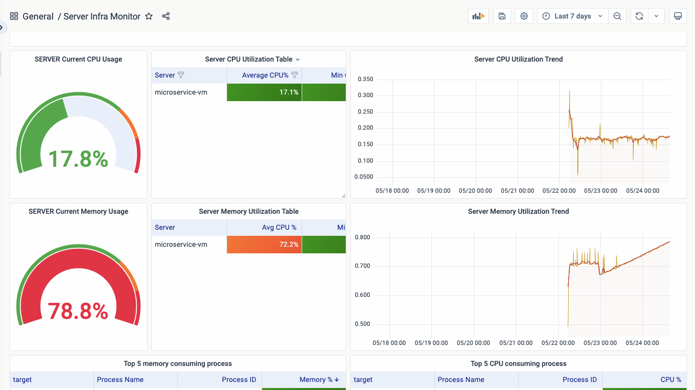
You can select various panel types within the same dashboard and arrange them side by side to assess the impact of server health from different components and vice versa. This allows for a comprehensive understanding of the overall server health status.
![]()
![]()
In summary, our infrastructure observing dashboard empowers us with real-time visibility, proactive alerts, historical analysis, and troubleshooting capabilities. By leveraging this solution, we can ensure a robust and optimized infrastructure, delivering uninterrupted services to our customers and gaining a competitive edge in the market.
![]()
![]()
You can export Dashboards from vuSmartMaps for multiple purposes and this feature comes in handy when you need it for external usage. Exporting dashboards to external media formats like images and PDFs in vuSmartMaps offers several useful applications:
![]()
![]()
![]()
By providing the option to export dashboards to external media formats, vuSmartMaps empowers users to share, utilize, and integrate their dashboards in a variety of contexts, ensuring flexibility and accessibility in data visualization and analysis.
![]()
![]()
![]()
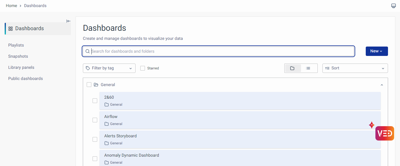
In vuSmartMaps, accessing your dashboards is a seamless process. Simply navigate to the Left Navigation Menu and click on “Dashboards.” From there, you’ll see a list of available dashboards. Choose the one you want to view by clicking on its name or thumbnail. The selected dashboard will load, presenting the configured visualizations and data panels in a user-friendly interface.
![]()
![]()
The dashboard interface provides options for managing and configuring dashboards, including:
![]()
![]()
💡Note: To learn how to create a new dashboard refer to this link
![]()
Within the dashboard, you can leverage a diverse range of panel types, including predefined options such as:
![]()
![]()
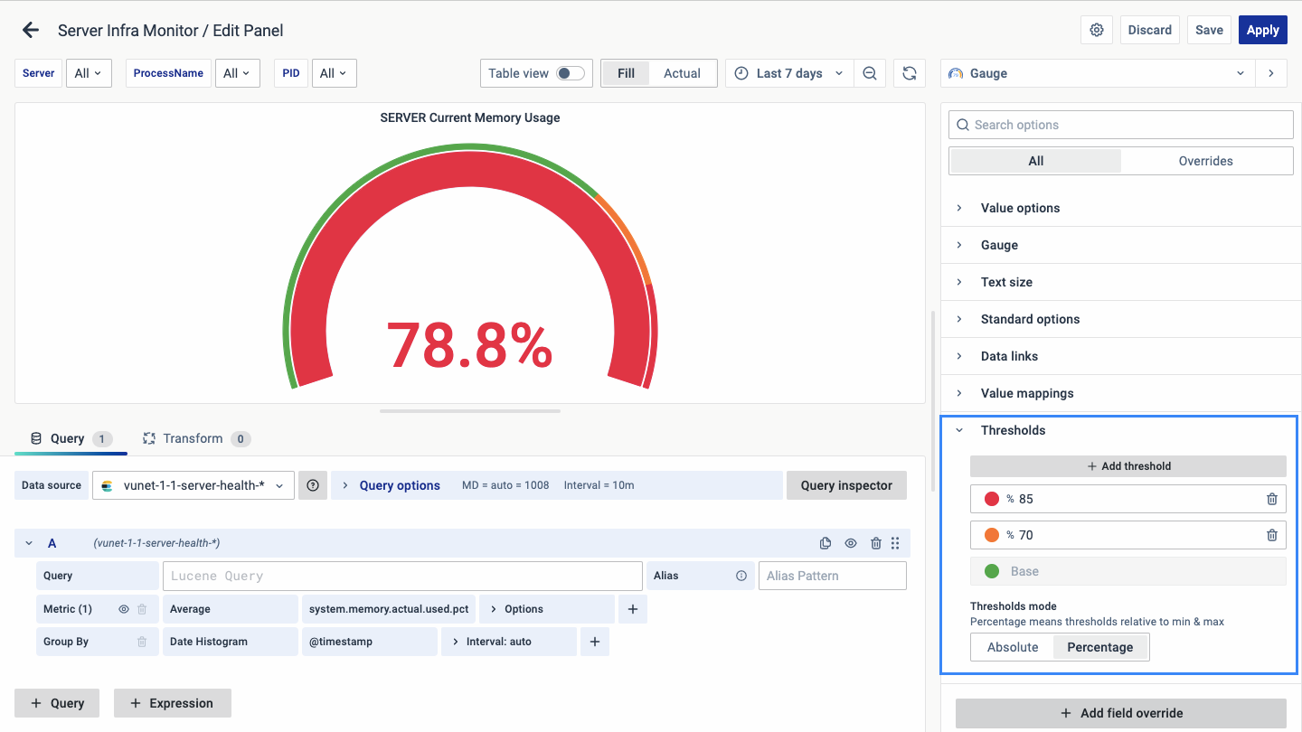
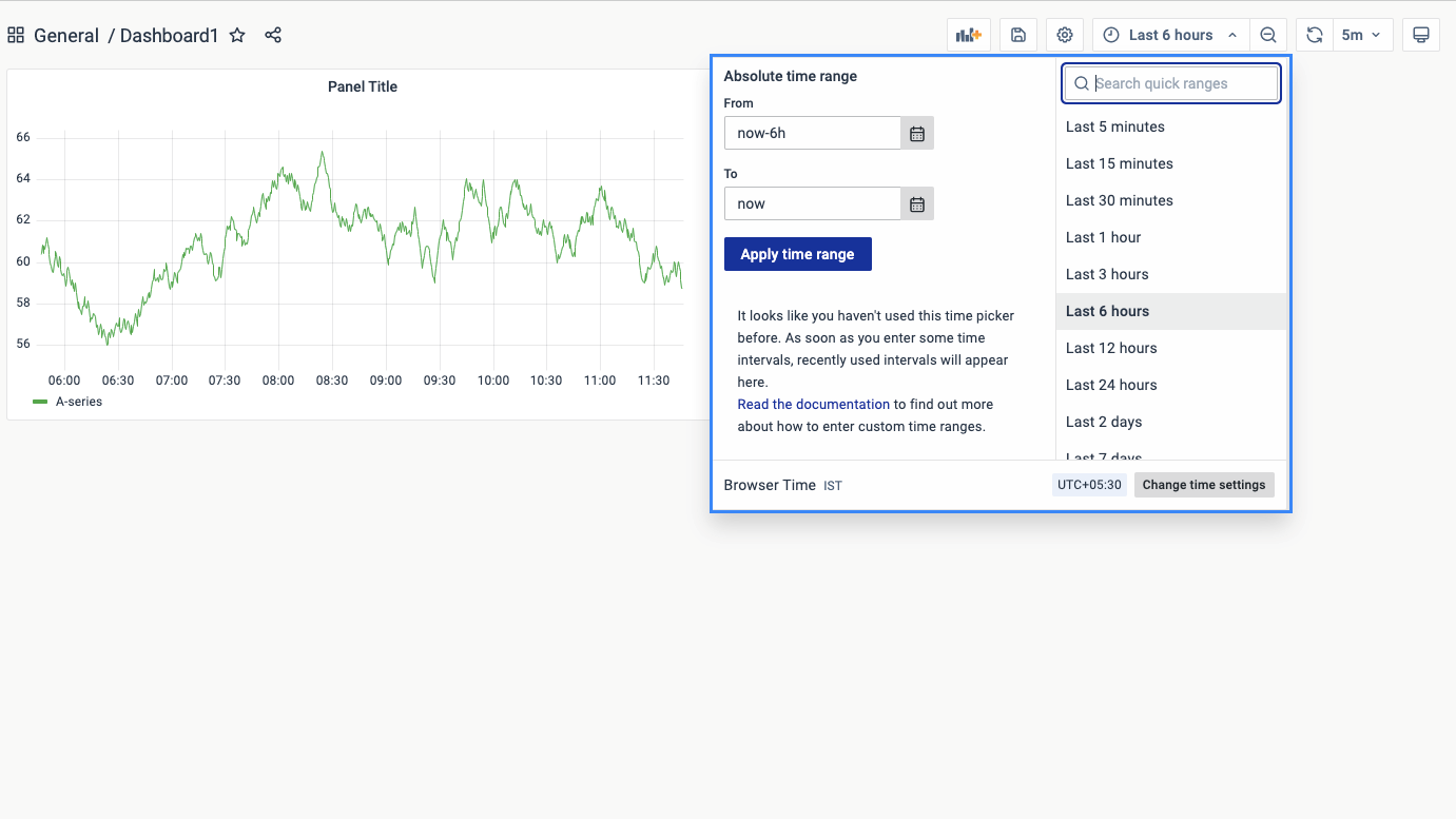
Selecting the appropriate time range for your analysis is crucial, and vuSmartMaps makes it easy. Within your dashboard, you’ll find a time range selector typically located at the top right corner. Click on it to reveal a dropdown menu or calendar. From there, you can choose from predefined relative time ranges like “Last 30 minutes” or “Last 7 days,” or set a custom absolute time range. Once selected, the dashboard will update automatically to display data within the specified time frame.
![]()
![]()
![]()
Drilling down into your data allows for deeper exploration and understanding. In vuSmartMaps, initiate a drilldown by clicking on a specific visualization or data point within the dashboard. Depending on the configuration, the dashboard will transition to a more detailed view, providing additional insights related to the selected data. Continue drilling down further into the data hierarchy by interacting with subsequent visualizations or data points.
![]()
![]()
Search and filter functionalities streamline data exploration and analysis. Look for the search or filter input field located near the top of the dashboard interface. Enter relevant keywords, terms, or values to dynamically filter the displayed data. As you type, the dashboard will update in real-time to show matching results. Additionally, apply predefined filters or filter conditions to refine the data further based on various criteria such as time, category, or specific data attributes.
![]()
![]()
You can configure the various panels and visualizations within vuSmartMaps, to learn more explore the visualizations panel page.
![]()
Dashboard Settings offer further configuration capabilities, allowing you to adjust parameters such as the dashboard’s name, description, and time options according to your preferences. Additionally, you can efficiently manage the dashboards by creating playlists, viewing snapshots, and accessing library panels for additional functionality. Dashboard Filters and Variables are crucial in facilitating refined data analysis, enabling to focus on specific criteria and dynamically adjust data based on selected variables.
![]()
You can download Data Statistics in CSV format for deeper analysis, providing you with comprehensive insights for further exploration and interpretation. Finally, by saving the dashboard configurations, you can preserve your analytical setups for future use, ensuring the saved dashboard is ready to use.
![]()
![]()
Explore vuSmartMaps’ adaptable Business Journey and Operational Storyboards, tailored to deliver insights for diverse user roles across financial institutions, fintech, banks, and beyond.
![]()
![]()
With the RCABot storyboard, you can gain insights into incidents, early warnings, and conduct in-depth analysis, thereby enhancing journey management for improved user experiences and operational efficiency
![]()
![]()


