1. Getting Started with vuSmartMaps™
3. Console
5. Configuration
6. Data Management
9. Monitoring and Managing vuSmartMaps™
There are so many options to manage and configure dashboards. You will learn more about them below.
![]()
![]()
Navigate to the toggle menu and then click on the Dashboards dropdown menu.
![]()

![]()
There are 4 main options to manage the dashboard.
![]()

![]()
![]()
Under Dashboard, the Manage Dashboards screen will appear and all the dashboards will be listed here.
![]()

![]()
The manage dashboards options under Dashboards include:
![]()
![]()
To create a new folder and add dashboards in it.
![]()
![]()

![]()
Your newly created folder will look like this.
![]()

![]()
You can click on the +Create Dashboard button to create a new dashboard. in that folder.
![]()
You can also go to Manage Dashboards and add a dashboard to the folder from there.
![]()
Select the dashboards that you want to add, and click on Move.
![]()

![]()
You can now see that the selected dashboards are added to your newly created folder.
![]()

![]()
You can import a dashboard from outside sources by clicking on the Import button.
![]()

![]()
There are 3 ways to import a dashboard:
![]()
![]()
![]()
The dashboards can be grouped together in 2 different ways and then can be sorted alphabetically.
![]()

![]()
![]()
To delete a Dashboard, select a dashboard and click on Delete.
![]()

![]()
Click on a Dashboard to further edit it.
![]()

![]()
Every time you edit and save the dashboard after making changes, you can add notes to remember the edits.
![]()

![]()
vuSmartMaps provides the following options to edit the Dashboard properties.
![]()
![]()
![]()
![]()
Click on the Cycle view mode to see the dashboard in full-screen.
![]()

![]()
Click on the Cycle view mode again to change the view modes.
![]()

![]()
You can click on Esc on your keyboard to exit the full-screen view.
![]()
![]()
vuSmartMaps provides several ways to manage the time ranges of the data being visualized, for the dashboard, panels, and also for alerting.
![]()
![]()
It supports the following time units: s (seconds), m (minutes), h (hours), d (days), w (weeks), M (months), Q (quarters), and y (years).
![]()
The minus operator enables you to step back in time, relative to the current time.
![]()
The plus operator enables you to step forward in time, relative to the current time. For example, you can use this feature to look at predicted data in the future.
![]()
Select the relative time range from the Relative time ranges list. You can filter the list using the input field at the top.
![]()

![]()
The quick time ranges list includes:
![]()
![]()
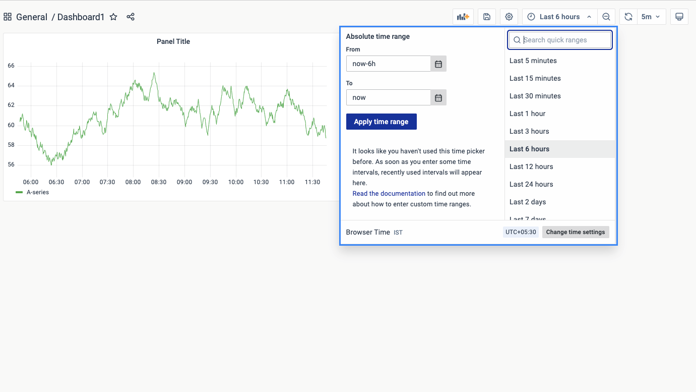
You can set an absolute time range in the following ways:
![]()
![]()

![]()
This section also displays recently used absolute ranges.
![]()
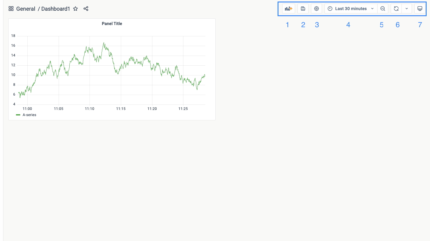
A time filter present in the top right corner of the screen is used to select a time range.
![]()
![]()
Click on the Refresh dashboard icon to immediately run every query on the dashboard and refresh the visualizations. It cancels any pending requests when you trigger a refresh.
![]()
By default, it does not automatically refresh the dashboard. Queries run on their own schedule according to the panel settings.
![]()
However, if you want to regularly refresh the dashboard, then click the down arrow next to the Refresh dashboard icon and then select a refresh interval.
![]()

![]()
You can select an interval and the Dashboard will automatically refresh at the set time period.
![]()
![]()
Dashboard filters are an effective mechanism employed within dashboards to refine the dataset presented based on specific criteria. These filters serve multiple purposes, including the ability to concentrate on particular data subsets, facilitate data comparison, and enable the creation of configurable views tailored to specific requirements.
![]()
For instance, dashboard filters can be leveraged to observe and evaluate the performance of a targeted application or network device. A support engineer, for instance, can utilize a dashboard filter to access and scrutinize detailed information pertaining to a particular application or network device.
![]()
![]()
Variables in dashboards are placeholders for dynamic values used in metric queries and panel titles. They enable the creation of dynamic filters, allowing the filter to be modified based on the variable’s value. By changing the variable value, the metric queries in the dashboard can be adjusted accordingly. For instance, a variable like “$server_name” can be utilized in a metric query to filter CPU usage data for a specific server. Updating the variable value will automatically update the dashboard to display CPU usage for the newly selected server.
![]()
![]()
Query variables are utilized to populate dropdown lists with values retrieved from data sources based on specific queries. These variables enable users to select options dynamically, which are often employed in filters to refine data based on their selections. For instance, a query variable can be created to fetch a list of countries from a database, allowing the user to choose a specific country and display data pertaining only to that selection.
Custom variables, on the other hand, are manually defined variables that offer greater control over available options. They can be populated with predefined values or criteria, and are commonly used in filters to restrict data based on specific requirements. As an example, a custom variable can be created with severity levels such as “Critical,” “Error,” “Warning,” and “Information,” which can then be used in a filter to display data relevant to the selected alert severities.
Text box variables provide users with the flexibility to enter free-form text values as filters within a dashboard. This type of variable allows for searching or filtering data based on specific text criteria. For instance, a text box variable can be employed as a filter in the dashboard to narrow down data by a specific transaction ID, such as “T1234-5678-9012-3456.”
Ad-hoc variables are dynamic filters that enable users to interactively apply filters on the fly while viewing a dashboard. They allow for quick exploration of specific subsets of data without requiring pre-configuration or predefined filters. For example, an Ad-hoc variable can be created as a filter in the dashboard to filter the last five days’ transactions for a particular customer using a query like “customer name = <name> AND @timestamp = last 5 days.”
![]()
![]()
Select the Dashboard that you want to create filers for and follow the steps ahead.
![]()
![]()

![]()

![]()
![]()

![]()
💡Note: Query, Custom, Text Box, and Ad hoc Filters are only in function currently.
💡Note: The options to be filled will depend on the type of Query selected.
![]()

![]()
You can see the new filter added to the list of variables.
![]()

![]()
![]()
vuSmartMaps also provides an option to view the data statistics in terms of data, stats, codes, etc. You can also ask for a new query. Even though you use graphs to visualize the data, sometimes you need all the details and stats in tabular format.
![]()
The raw data that you receive from the input can be converted into a simpler format along with its stats. To download and view the data statistics:
![]()
Under the Edit Dashboard, click on the Query Inspector button.
![]()

![]()
You will be redirected to the Inspect Panel which contains the following options:
![]()
Data: It shows the total units of data received based on the metric selected.
Stats: It shows the request time and the number of queries.
JSON: It shows the code.
Query: It triggers a new Query.
![]()
Go to the Data section, and Click on Download CSV.
![]()

![]()
All the data points that are added based on the Metric and Group by properties will be downloaded.
![]()
The selected data will be downloaded in a CSV format that you can use for further application.
![]()
![]()
In the top right corner, there are 3 options:
![]()

![]()
![]()
To save the Dashboard, go to Save, give the Dashboard a name, set a Folder, and click on Save.
![]()

![]()
This is how your saved Dashboard will look like.
![]()


