Visualizations
Introduction
Visualization Panels are essential tools for data visualization and effectively presenting information through various visual elements. Explore a diverse range of charts, tables, gauges, metrics, heatmaps, and more to display your data in a manner that suits your requirements. Each panel type offers unique features and benefits, enabling you to create impactful visualizations effortlessly.
Visualization panels are divided into two categories, i.e., Predefined Panel and Custom Panel. Each panel features a query editor specific to its data source, allowing you to craft queries for visualizing your chosen data. Let's now take a closer look at each panel type to understand their distinct feature.

Predefined Panel
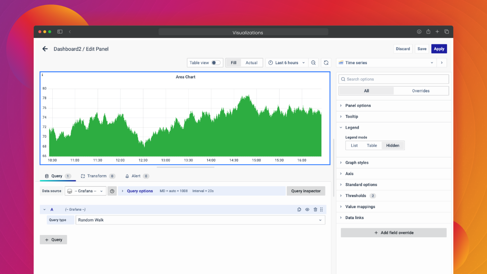
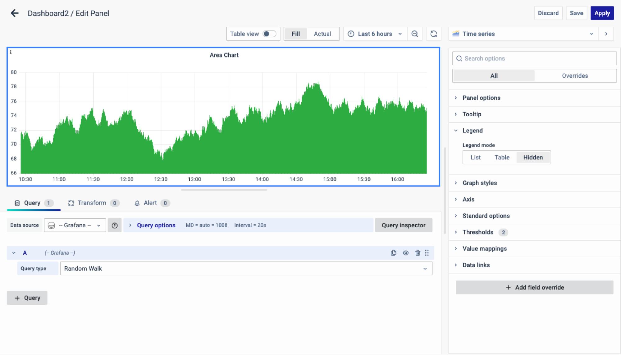
Area Chart
Area chart illustrates time-series data trends by connecting data points with lines, often filled with color or shading for emphasis
Line Chart
A Line Chart connects data points with lines to visualize changes in value, ideal for comparing trends across multiple series such as tracking profit changes for different departments over time.

Heatmap
Heatmap visualizes data using color variations in two dimensions, offering a clear representation of distribution or changes in magnitude, ideal for transforming complex data into easily comprehensible visuals.

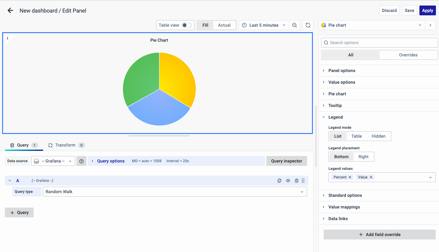
Pie Chart
A Pie Chart is a circular graphic with slices proportional to represented quantities, commonly used for illustrating percentages or proportional data, ideal for visualizing data with five categories or fewer.
Data Table
Data Table displays information in a tabular format, ideal for presenting data over time or across different groups, with features like customizable row count, color coding, serial numbering, percentage display, and cumulative results.

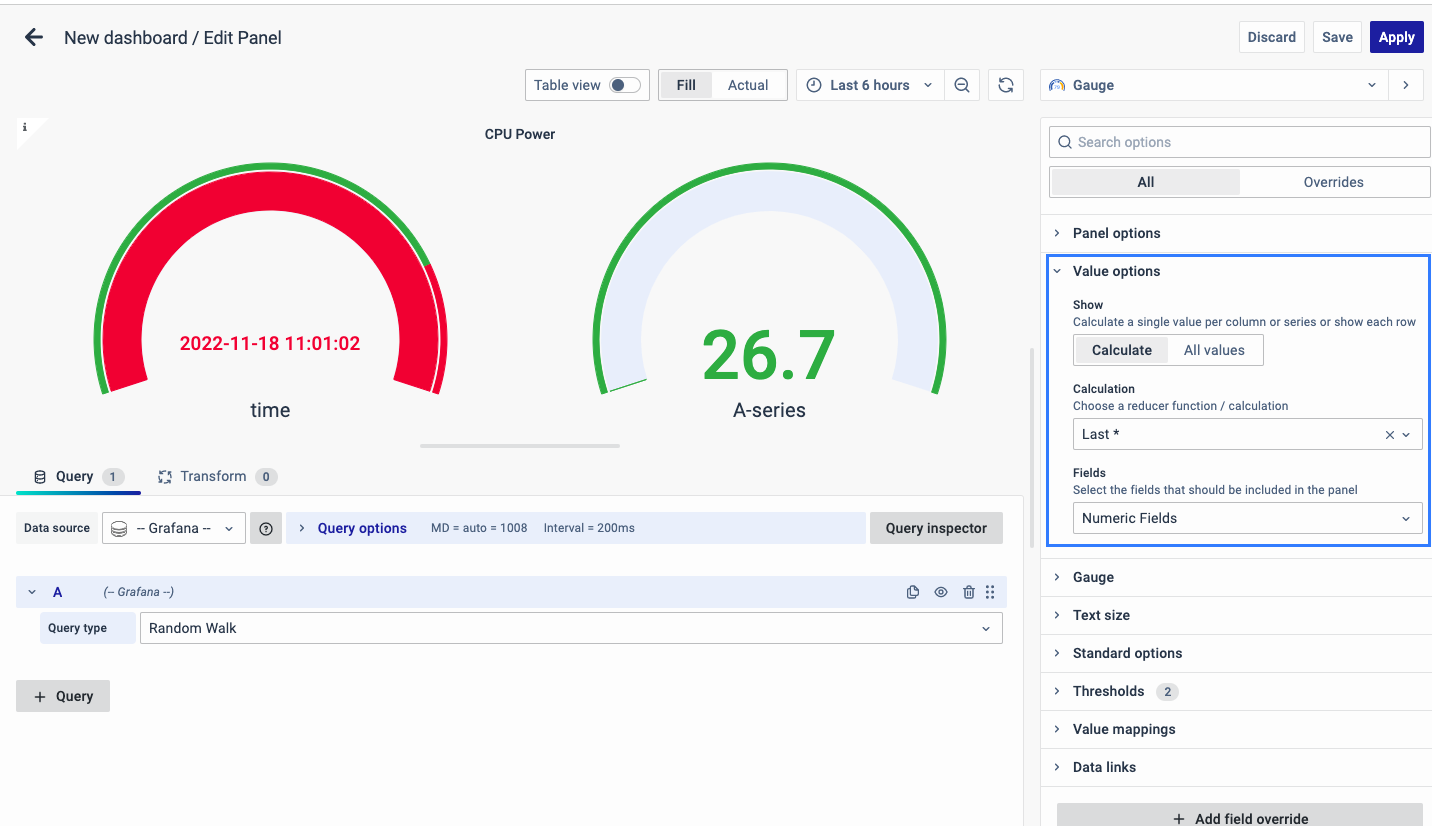
Gauge Chart
Gauge Chart uses needles on a dial to visually represent data readings, offering simplicity in creation and interpretation, making it user-friendly and intuitive for displaying performance-based metrics.
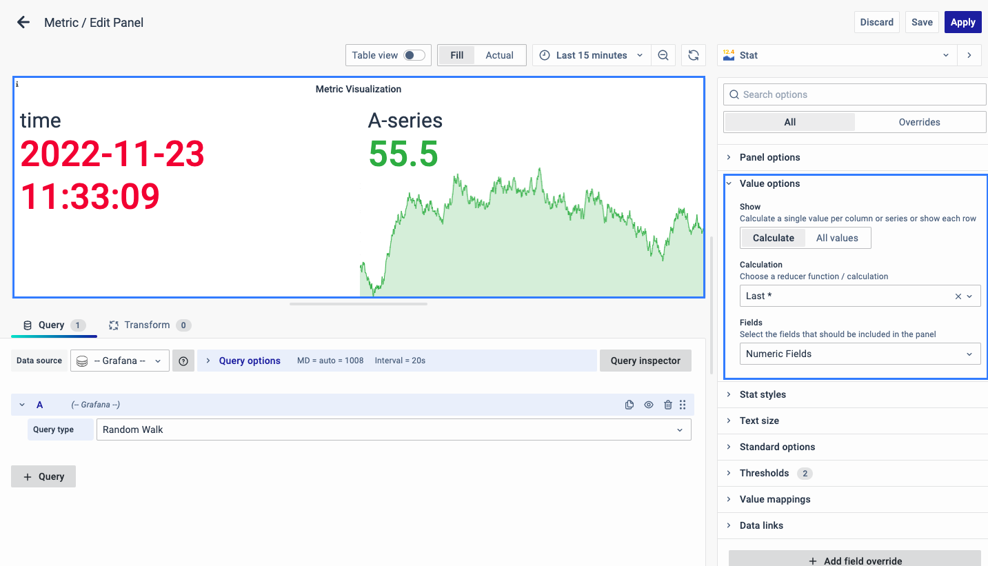
Metric
Standards for measurement or evaluation, are ideal for displaying total values and facilitating quick comparisons between different time periods, offering simplicity in data visualization.
HTML Widget
HTML Widget Visualization utilizes HTML code to craft custom visualizations for dashboards, offering flexibility and enhanced functionality. Key features include error spotting with line numbers, autocomplete, auto-indentation, and collapsible/expandable HTML tags for user-friendliness

Custom Panel
Matrix Visualization
A robust tool for tabular data presentation, ideal for displaying aggregated metrics across various groups. Key features include the ability to combine categories, organize data with row and column groups, control over displayed rows per page, color coding, serial numbering, percentage display, cumulative rows and columns, and special reporting options.

Insight Visualization
Insights are integral in business, providing deeper understanding and valuable recommendations for improvement. By simplifying complex data presentation, insight-based dashboard panels offer actionable information, enabling users of all expertise levels to make informed decisions effectively. To learn more about insight visualization refer to this link.
Unified Transaction Map
A Unified Transaction Map (UTM) visually represents the flow of components within a network, application, or transaction. It highlights key metrics for each node and link and offers insights into the stages of business transaction phases. To learn more about UTM refer to this link.
FAQs
How are Visualization Panels categorized?
Visualization Panels are categorized into two main types: Predefined Panels and Custom Panels. Predefined Panels come with preset designs tailored to specific data types, while Custom Panels offer more flexibility for users to create their own unique visualizations. For a detailed breakdown, refer to the documentation
How can Visualization Panels help in tracking business performance?
Visualization Panels offer a suite of tools tailored to tracking business performance metrics. For instance, Line Charts are great for visualizing trends over time, while Gauge Charts provide a clear snapshot of key performance indicators. Additionally, Insight Visualizations offer actionable recommendations based on data analysis, empowering users to make informed decisions. Check out the documentation for real-world examples and best practices.
How can Visualization Panels simplify complex data presentation?
Visualization Panels offer several features aimed at simplifying complex data presentation. Insight Visualizations, for example, provide deep insights into data trends and patterns, making it easier for users of all skill levels to understand and act upon data. By leveraging these tools, users can streamline their data presentation process and drive more informed decision-making. Dive deeper into our documentation to unlock the full potential of Visualization Panels.
I'm having trouble presenting tabular data effectively. What should I use?
If you're struggling to present tabular data effectively, consider using the Matrix Visualization Panel. This robust tool allows for the presentation of aggregated metrics across various groups, with features such as color coding and customizable row and column organization.
I am uncertain about how to visually represent network or transaction flow. Do you have any recommendations?
Visualizing network or transaction flow can be challenging, but our Unified Transaction Map (UTM) Panel is specifically designed to address this need. By visually representing the flow of components within a network or transaction, the UTM Panel provides valuable insights into key metrics and transaction phases. Explore our documentation for tips and best practices on using the UTM Panel.
How can I create custom visualizations for my dashboard?
Creating custom visualizations for your dashboard is made easy with the HTML Widget Visualization Panel. This feature allows you to leverage HTML code to craft unique visuals tailored to your specific needs. With features like error spotting, autocomplete, and collapsible HTML tags, the HTML Widget Panel offers unparalleled flexibility and functionality. Get started with creating custom visuals by referring to our documentation.
How do I choose the right visualization panel for my data?
Choosing the right panel depends on your data type and objective:
- For trend analysis: use Line Charts or Area Charts.
- For category comparison: use Pie Charts or Data Tables.
- For advanced insights: try Insight Visualization or UTM panels.
Can I customize the look of predefined visualizations without using HTML?
Yes! Most predefined panels offer configuration options such as:
- Color schemes
- Thresholds
- Data formatting
- Other display settings
You can personalize your visualizations directly from the settings menu in the panel editor, without writing any code.
