Heat Map
A heat map (or heatmap) is a data visualization technique that represents data using colors in two dimensions. It uses color variation to display the magnitude of a phenomenon, providing a clear visual representation of how the phenomenon is distributed or changes across an area.
Heatmaps are valuable because they transform complex data into easily comprehensible visuals. They intuitively convey information, with warmer colors indicating a higher concentration of interactions or data points.
Creating a Heatmap
To create the Heat Map
- Create a New Dashboard Panel
- Configure the Query and select the appropriate Data Source
(Refer to Dashboard Basics > Query)
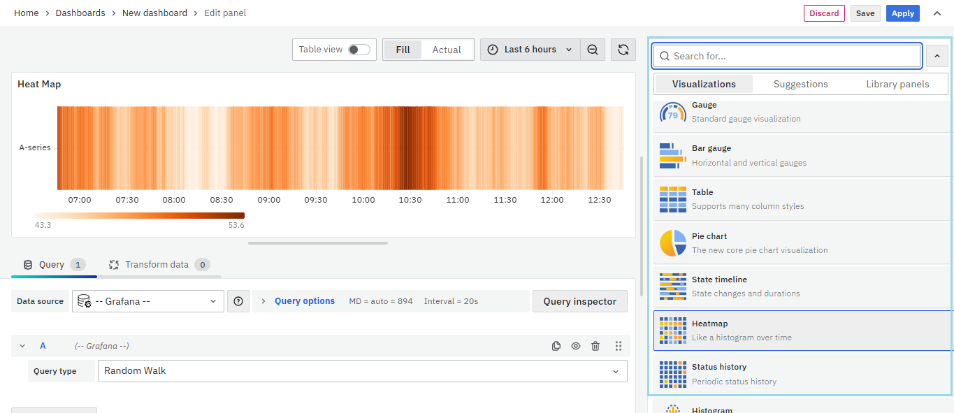
Select Visualization
On the right side of the default screen, select Visualization as Heatmap to create a Heatmap panel.
Visualization Options
Panel Options
There are multiple options to edit the properties of the panel. The first one is Panel Options. Enter a Name and Description for the Panel that you want to create. For instance, if you're making a Heatmap to track CPU usage, name the panel "Heatmap" and describe it as "CPU Usage."
 The Description is available in the top left corner and can be viewed by hovering over the i button.
The next part of Panel Options is Panel Link where you can point a link to any other website or dashboard of your choice. Enter a title, URL and select the ‘Open in a new Tab’ option if you want to open the link in a new tab. Click Save.

The URL can be a link to another dashboard or for getting help or useful info. When you click on a panel, it opens the link either in the same tab or a new tab, depending on your choices. For example, if you want to compare a default dashboard, just click the link to open it.
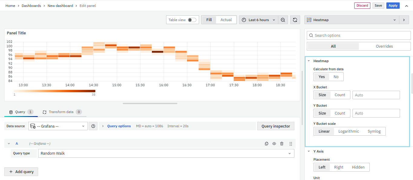
Heatmap
Calculate from data: This option determines whether the heatmap data is already calculated from the data source or transformer, or if it should be computed directly in the panel.
X Bucket: This setting defines how the x-axis is divided into buckets. You can specify a time interval using the Size input (e.g., 1h creates 1-hour wide cells on the x-axis). Alternatively, you can set the interval based on Count.
Y Bucket: This option defines how the y-axis is split into buckets. You can choose to divide it by Size or Count.
Y Bucket scale: This setting lets you choose the scale for y-axis values. The available options include:
- Linear – Uses a linear scale.
- Logarithmic – Select a log base of 2 or 10.
- Symlog – Uses a symlog scale. Choose a log base (2 or 10) and specify a Linear threshold value.
Y-Axis

Defines how the Y axis is displayed.The Y-Axis options include:
-
Unit: Unit configuration.
-
Scale: linear or logarithmic.
-
Decimals: This setting determines decimal configuration.
-
Y- Min/Max value: This setting configures the axis range.
-
Width: The width of the axis.
-
Axis Label: This setting configures the axis value.
-
Reverse: When selected, the axis appears in reverse order.

Colors
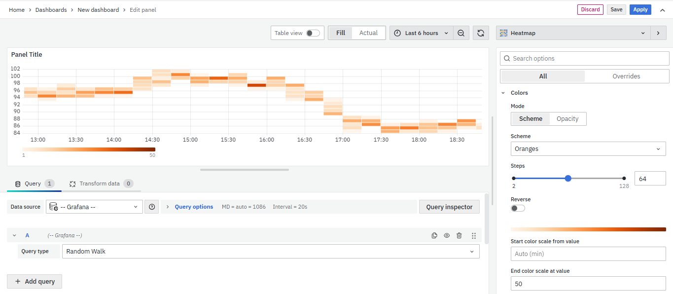
Color spectrum: Maps bucket count to color (min → max). May invert in light theme.
Mode:
- Scheme – Color varies by value.
- Opacity – Opacity varies; color stays fixed.
Scale: Scale for mapping bucket values to the opacity
Steps: Choose between 1–128 color steps.
Reverse: Flip color scheme (for Scheme mode).
Start/End: Set custom min/max values for color mapping.
Cell Display

- Unit: Set the unit for cell values.
- Decimals: Define how many decimal places to show.
- Cell gap: Adjust spacing between cells.
- Hide ≤: Hide cells with values less than or equal to this value.
- Hide ≥: Hide cells with values greater than or equal to this value.
Tooltip
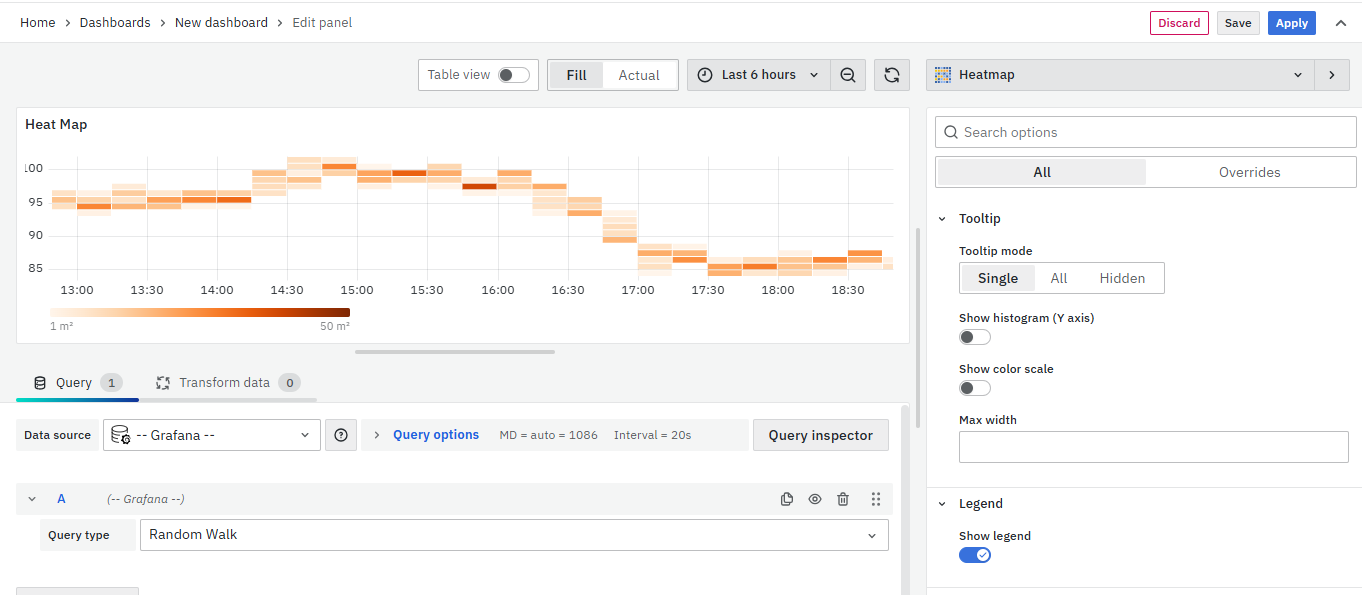
- Show tooltip: Show heatmap tooltip.
- Show Histogram: Show a Y-axis histogram on the tooltip. A histogram represents the distribution of the bucket values for a specific timestamp.
- Show Color Scale: This option controls whether or not the tooltip includes the color scale that’s also represented in the legend.
- Max Width: Set the maximum width of the tooltip box.
You can set the Tooltip options as per your preference.
Legend
Choose whether you want to display the heatmap legend on the panel.
Exemplars
Set the color used to show exemplar data.

Data Links
The Data Links option is similar to the Panel Link where you can link a URL and then open it in another tab. It is placed on the data instead of the Panel.
You can click on the data anywhere and the link option will appear.
It is used for an instant link that you want to appear anytime you click on the data.
You have now learned how to configure the Heatmap, change the panel settings, and more. You can save and edit the panel later too.
FAQs
What is a heat map and why should I use it?
A heat map is a data visualization technique that uses color variation to represent data magnitude in two dimensions.
- It simplifies complex data into easy-to-understand visuals.
- Helps identify patterns and trends quickly.
- For more details, see Heat Map.
How do I create a heat map in my dashboard?
- Create a new dashboard panel.
- Configure the query with the appropriate data source.
- Select Heatmap as the visualization type.
- See Creating a Heat Map for detailed steps.
How can I use a heat map to monitor CPU usage?
- Create a new heat map panel.
- Name it appropriately (e.g., "CPU Usage Heatmap").
- Configure it to display CPU usage over time.
- For setup details, refer to Panel Options.
What should I do if my heat map isn't displaying data correctly?
- Ensure the query and data source are correct.
- Check visualization settings such as axes, buckets, and data format.
- Troubleshoot using Visualization Options.
How can I customize the color scheme of my heat map?
- Adjust the color spectrum and opacity to better represent data values.
- See Display and Color Scale for detailed instructions.
How can I interpret the color variations in the heat map?
- Warmer colors indicate a higher concentration of data points.
- You can customize the color scale settings to refine visualization.
- More information is available in Display Options.
Can I link the heat map panel to other dashboards or websites?
Yes, you can add panel links to direct users to other dashboards or external websites for more information. Detailed instructions are available in the Panel Link section.
My heat map panel isn't showing the legend. How can I enable it?
- Go to panel settings and enable the legend option.
- For more details, refer to Legend.
How can I adjust the transparency of the heat map cells based on data values?
- Use the Opacity mode in Display settings.
- The base color remains the same, but transparency changes based on data values.
- This helps in differentiating areas of high and low data concentration.
