Heat Map
A heat map (or heatmap) is a data visualization technique that represents data using colors in two dimensions. It uses color variation to display the magnitude of a phenomenon, providing a clear visual representation of how the phenomenon is distributed or changes across an area.
Heatmaps are valuable because they transform complex data into easily comprehensible visuals. They intuitively convey information, with warmer colors indicating a higher concentration of interactions or data points.
Creating a Heatmap
To create the Heat Map
- Create a New Dashboard Panel
- Configure the Query and select the appropriate Data Source
(Refer to Dashboard Basics > Query)
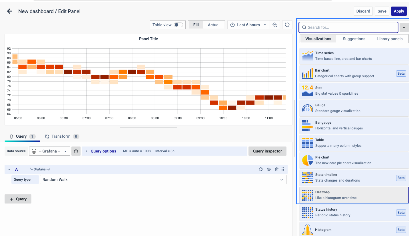
Select Visualization
On the right side of the default screen, select Visualization as Heatmap to create a Heatmap panel.
Visualization Options
Panel Options
There are multiple options to edit the properties of the panel. The first one is Panel Options. Enter a Name and Description for the Panel that you want to create. For instance, if you're making a Heatmap to track CPU usage, name the panel "Heatmap" and describe it as "CPU Usage."
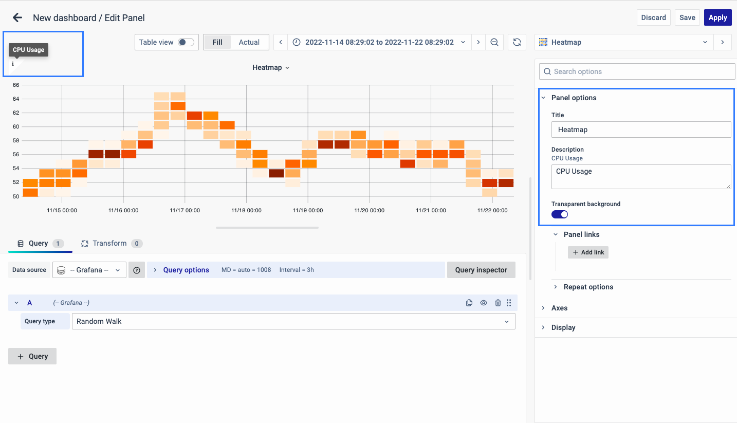 The Description is available in the top left corner and can be viewed by hovering over the i button.
The next part of Panel Options is Panel Link where you can point a link to any other website or dashboard of your choice. Enter a title, URL and select the ‘Open in a new Tab’ option if you want to open the link in a new tab. Click Save.
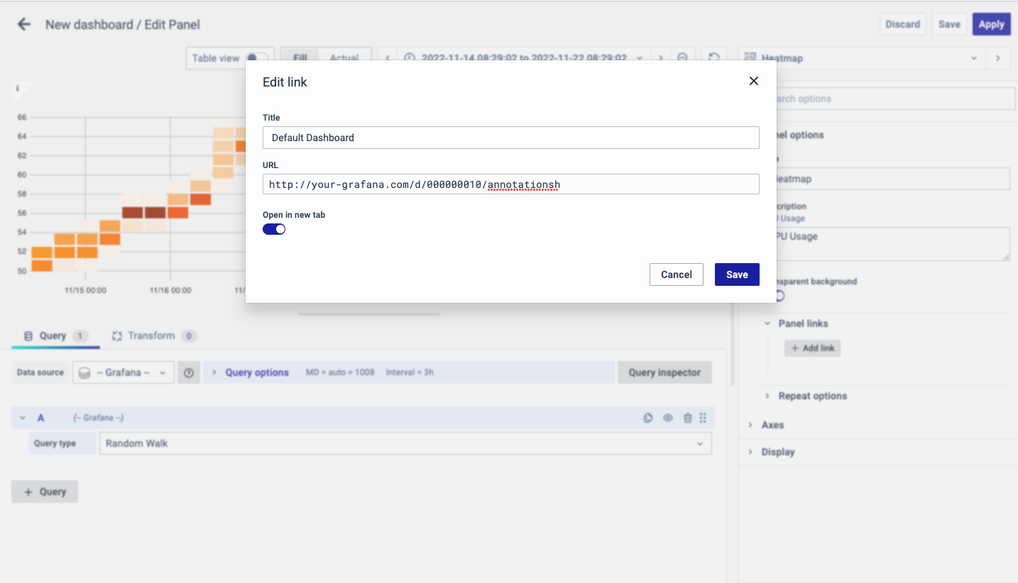
The URL can be a link to another dashboard or for getting help or useful info. When you click on a panel, it opens the link either in the same tab or a new tab, depending on your choices. For example, if you want to compare a default dashboard, just click the link to open it.
Axes
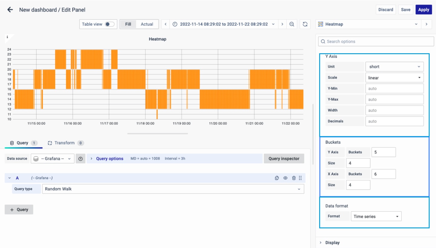
Y-Axis
Defines how the Y axis is displayed.The Y-Axis options include:
-
Unit: Unit configuration.
-
Scale: linear or logarithmic.
-
Decimals: This setting determines decimal configuration.
-
Y- Min/Max value: This setting configures the axis range.
-
Width: The width of the axis.
Buckets
This setting decides how the X-axis and Y-axis are divided. You can choose a time interval in the Size input. For instance, if you pick 1 hour, each cell on the X-axis will represent a one-hour time span.
-
Y-axis Bucket: Number of Buckets for Y-axis.
-
Size: Size of Bucket.
-
X-axis Bucket: Number of Buckets for Y-axis.
-
Size: Size of Bucket.
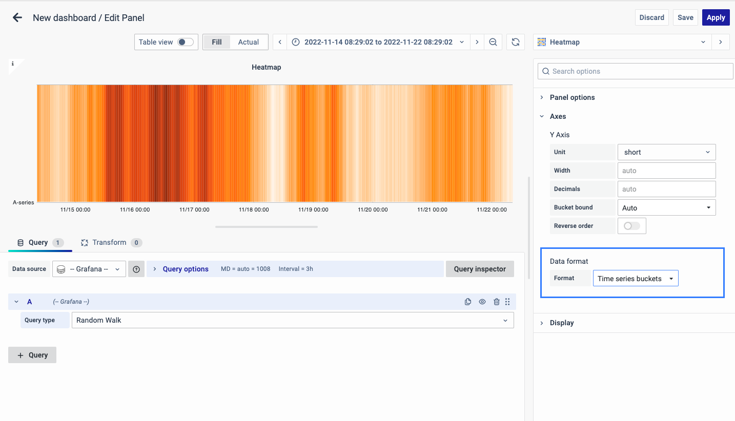
Data Format
The format of data to be used:
-
Time series: The x-axis is divided into normal time.
-
Time series Buckets: The x-axis is divided into Buckets based on the time-series.
Display
The color spectrum decides how colors are assigned based on the number of values in each bucket. The color on the left side represents the lowest count, and the one on the right side represents the highest count. Note that some color schemes may automatically switch when you use the light theme.
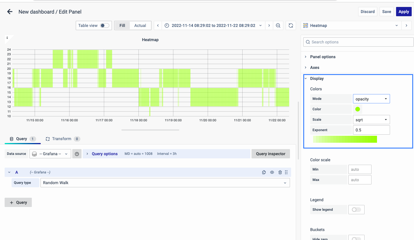
You can also switch to Opacity mode, which keeps the color the same but changes the transparency based on the bucket count.
-
Mode: Choose between Opacity and Spectrum.
-
Color: This is the base color for the cells.
-
Scale: It determines how bucket values are mapped to opacity.
-
Exponent value: If it's less than 1, you get a logarithmic scale; if greater than 1, it's exponential. For 1, it's a linear scale.
Color Scale
By default, cell colors are calculated using the minimum and maximum bucket values. But you can set your own values using Min and Max. Think of the bucket value like a Z-axis, and Min and Max as Z-Min and Z-Max, respectively.
Legend
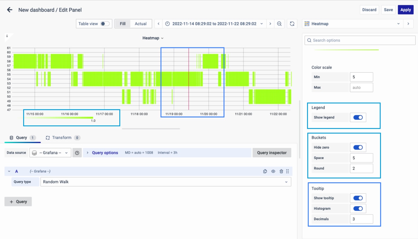
Choose whether you want to display the heatmap legend on the panel.
Buckets
-
Hide zero or not in the graph.
-
Space: value between spaces.
-
Round: round up to the nearest value.
Tooltip
- Show tooltip: Show heatmap tooltip.
- Show Histogram: Show a Y-axis histogram on the tooltip. A histogram represents the distribution of the bucket values for a specific timestamp.
- Decimals: Total numbers after the decimal point.
You can set the Tooltip options as per your preference.
You have now learned how to configure the Heatmap, change the panel settings, and more. You can save and edit the panel later too.
FAQs
What is a heat map and why should I use it?
A heat map is a data visualization technique that uses color variation to represent data magnitude in two dimensions.
- It simplifies complex data into easy-to-understand visuals.
- Helps identify patterns and trends quickly.
- For more details, see Heat Map.
How do I create a heat map in my dashboard?
- Create a new dashboard panel.
- Configure the query with the appropriate data source.
- Select Heatmap as the visualization type.
- See Creating a Heat Map for detailed steps.
How can I use a heat map to monitor CPU usage?
- Create a new heat map panel.
- Name it appropriately (e.g., "CPU Usage Heatmap").
- Configure it to display CPU usage over time.
- For setup details, refer to Panel Options.
What should I do if my heat map isn't displaying data correctly?
- Ensure the query and data source are correct.
- Check visualization settings such as axes, buckets, and data format.
- Troubleshoot using Visualization Options.
How can I customize the color scheme of my heat map?
- Adjust the color spectrum and opacity to better represent data values.
- See Display and Color Scale for detailed instructions.
How can I interpret the color variations in the heat map?
- Warmer colors indicate a higher concentration of data points.
- You can customize the color scale settings to refine visualization.
- More information is available in Display Options.
Can I link the heat map panel to other dashboards or websites?
Yes, you can add panel links to direct users to other dashboards or external websites for more information. Detailed instructions are available in the Panel Link section.
My heat map panel isn't showing the legend. How can I enable it?
- Go to panel settings and enable the legend option.
- For more details, refer to Legend.
How can I set custom minimum and maximum values for the color scale?
- Manually set Min and Max values for better control over data representation.
- See Color Scale for step-by-step instructions.
How can I adjust the transparency of the heat map cells based on data values?
- Use the Opacity mode in Display settings.
- The base color remains the same, but transparency changes based on data values.
- This helps in differentiating areas of high and low data concentration.
