Pie Chart
A pie chart is a circular statistical graphic with slices that are proportional to the quantity they represent. In a pie chart, the arc length of each slice (and consequently its central angle and area) is proportional to the quantity it represents.
It's typically used to illustrate percentages or proportional data, often accompanied by percentage labels next to each slice. Pie charts are most effective when depicting data with roughly five categories or fewer.
Creating a Pie Chart
To create the Pie chart
- Create a New Dashboard Panel
- Configure the Query and select the appropriate Data Source
(Refer to Dashboard Basics > Query)
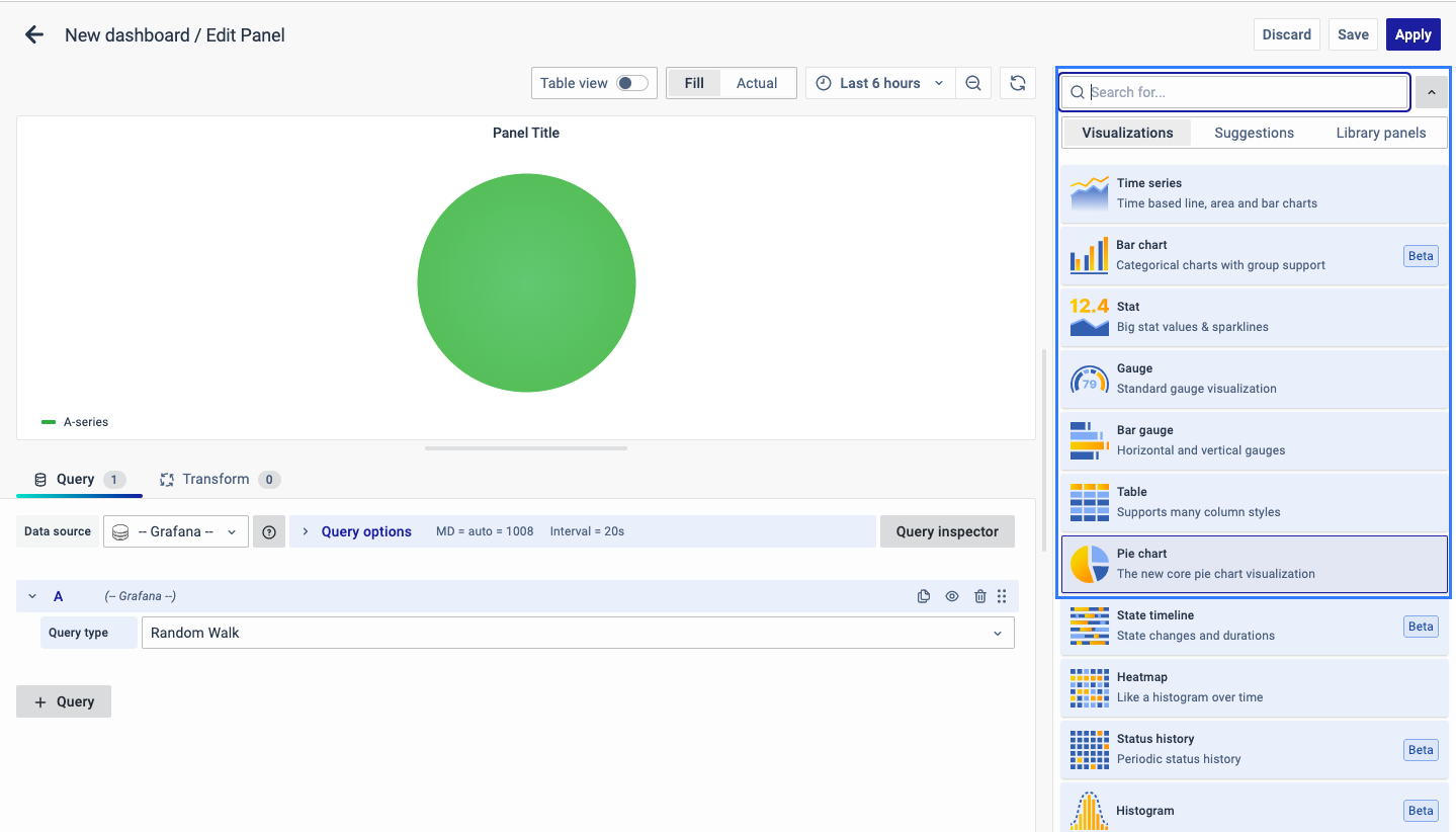
Select Visualization
On the right side of the default screen, select Visualization as a Pie Chart to create a Pie Chart panel.
Visualization Options
Panel Options
There are multiple options for editing the properties of the panel. The first one is 'Panel Options.' Enter a name and description for the panel you want to create. For example, if you're creating a pie chart to track power usage, name the panel 'Pie Chart' and describe it as 'Power Usage.'
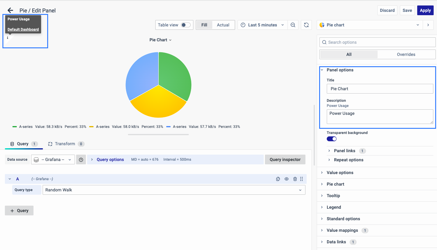
The Description is available in the top left corner and can be viewed by hovering over the i button.
The next part of Panel Options is Panel Link where you can point a link to any other website or dashboard of your choice. Enter a title, and URL, and select the ‘Open in a new Tab’ option to open the link in a new tab. Click Save.
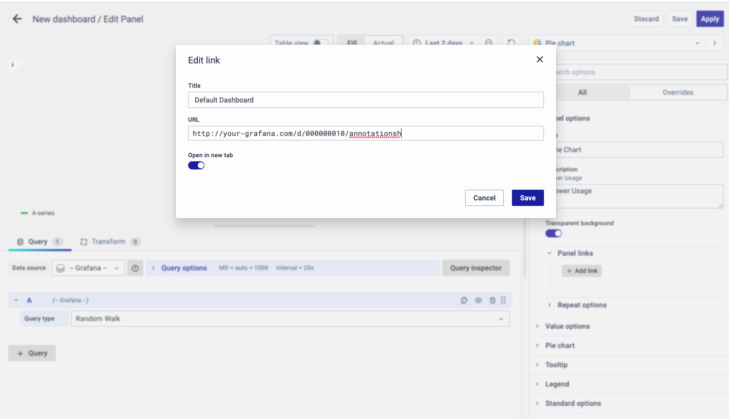
The URL can be a link to another dashboard or for getting help or useful info. When you click on a panel, it opens the link either in the same or a new tab, depending on your choices. For example, if you want to compare a default dashboard, just click the link to open it.
Value Options
Use the following options to refine the value in your panel.
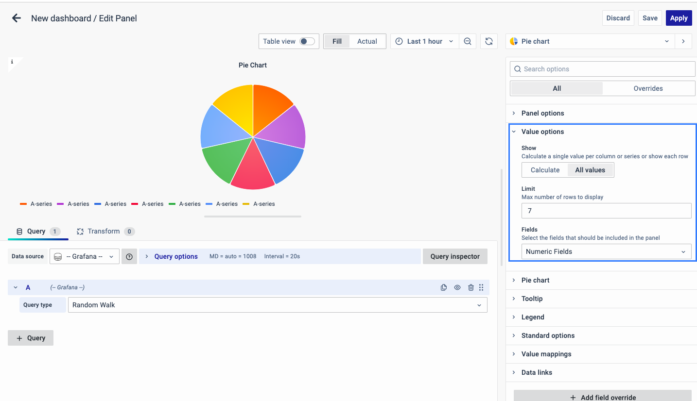
Show
Choose how much information to show:
-
Calculate - Reduces each value to a single value per series.
-
All values - Displays every value from a single series.
Limit
It limits the number of values displayed, instead of all the series values.
Fields
Select which field or fields to display in the panel. Each field name is available on the list, or you can select one of the following options:
-
Numeric fields: All fields with numerical values.
-
All fields: All fields that are not removed by transformations.
-
Time: All fields with time values.
-
A- Series: The standard A-series (main series)
Pie Chart
The pie chart options allow you to configure the pie chart display settings and include:
Piechart type
Select the pie chart display style.
Pie
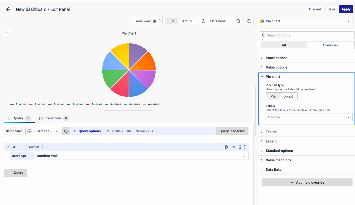
Donut
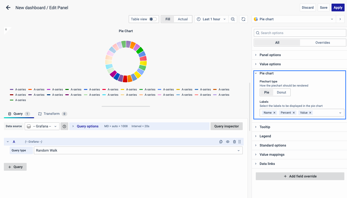
Labels
Select labels to display on the pie chart. You can select more than one.
-
Name: The series or field name.
-
Percent: The percentage of the whole.
-
Value: The raw numerical value.
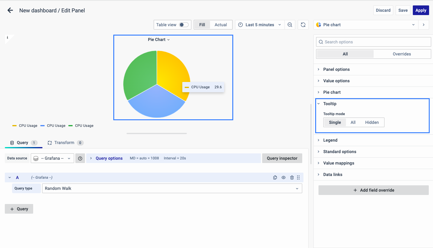
Tooltip
The following section is Tooltip which means showing the data information when the cursor is pointed at it.
It can be kept as single, all or hidden based on whether you want to see data information by hovering over the pie chart.
Legend
The next option is Legend which allows you to select the way you want the legend values to appear: bottom or right.
As for the Legend mode, you can display it in two ways:
- List: The legends are displayed as a list.
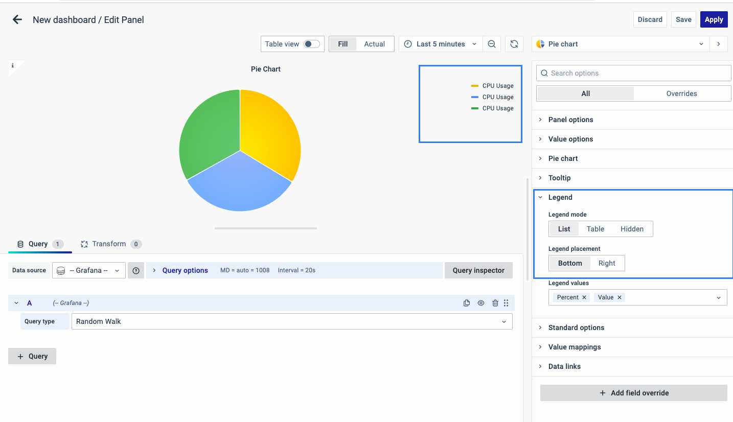
- Table: The legends are displayed as a table.
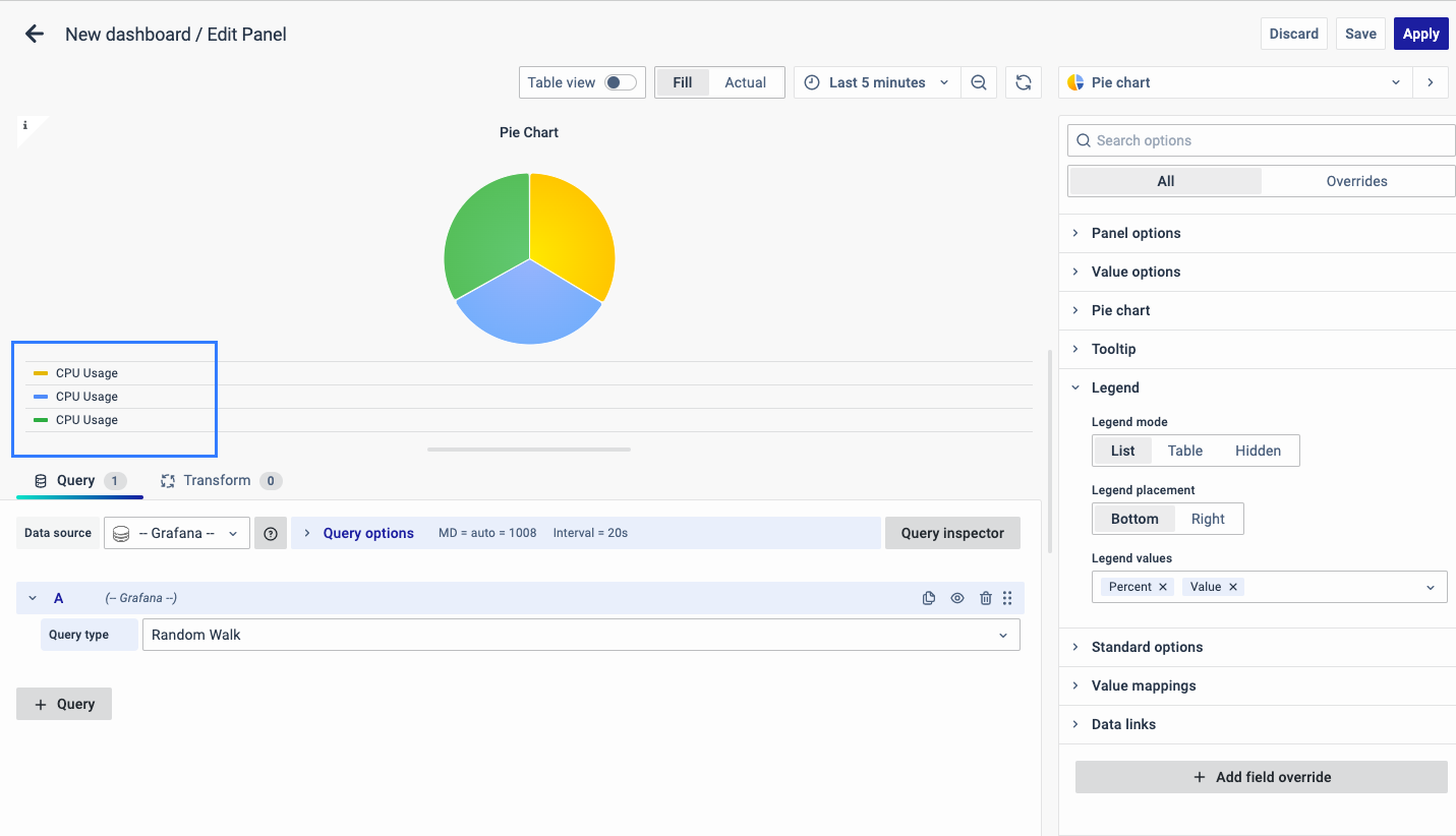
- Hidden: The legends are not displayed.
Legend Values:
You can select a number of values such as percent or values to show in the legend.
The values are the specific properties of the data.
The corresponding properties of the data will be displayed as a legend in the graph.
Standard Options
The Standard Options are used to configure the other standard settings in the graph. It changes the way the graph appears.
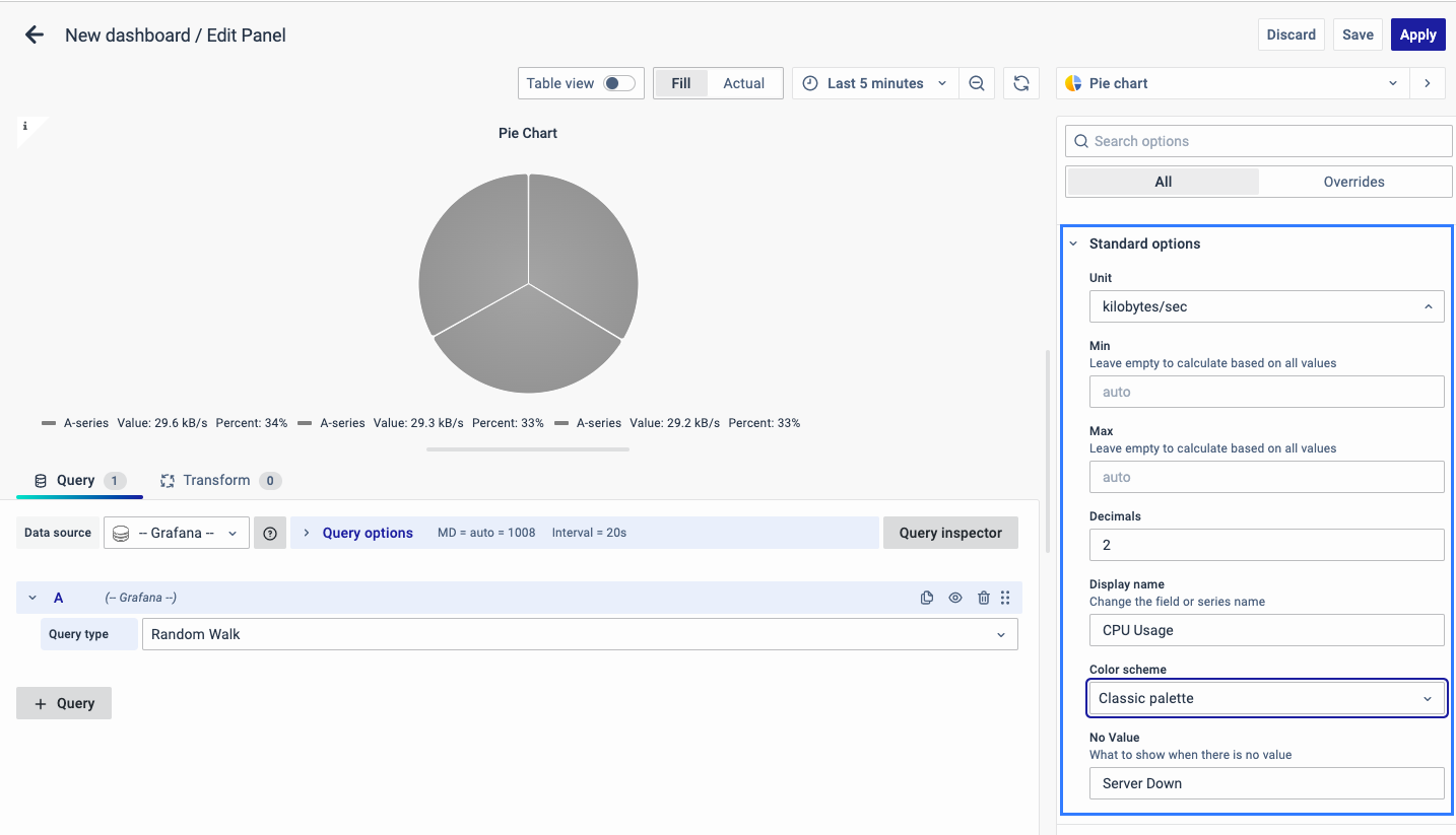
The Standard options include:
-
Unit type: The type of Unit parameters.
-
Min: Minimum value to be considered.
-
Max: Maximum value to be considered.
-
Decimal: Total digits after the decimal point.
-
Display name: Series name to be displayed.
-
Color scheme: choose a color scheme for the graph.
-
No Value: What to show when there is no value.
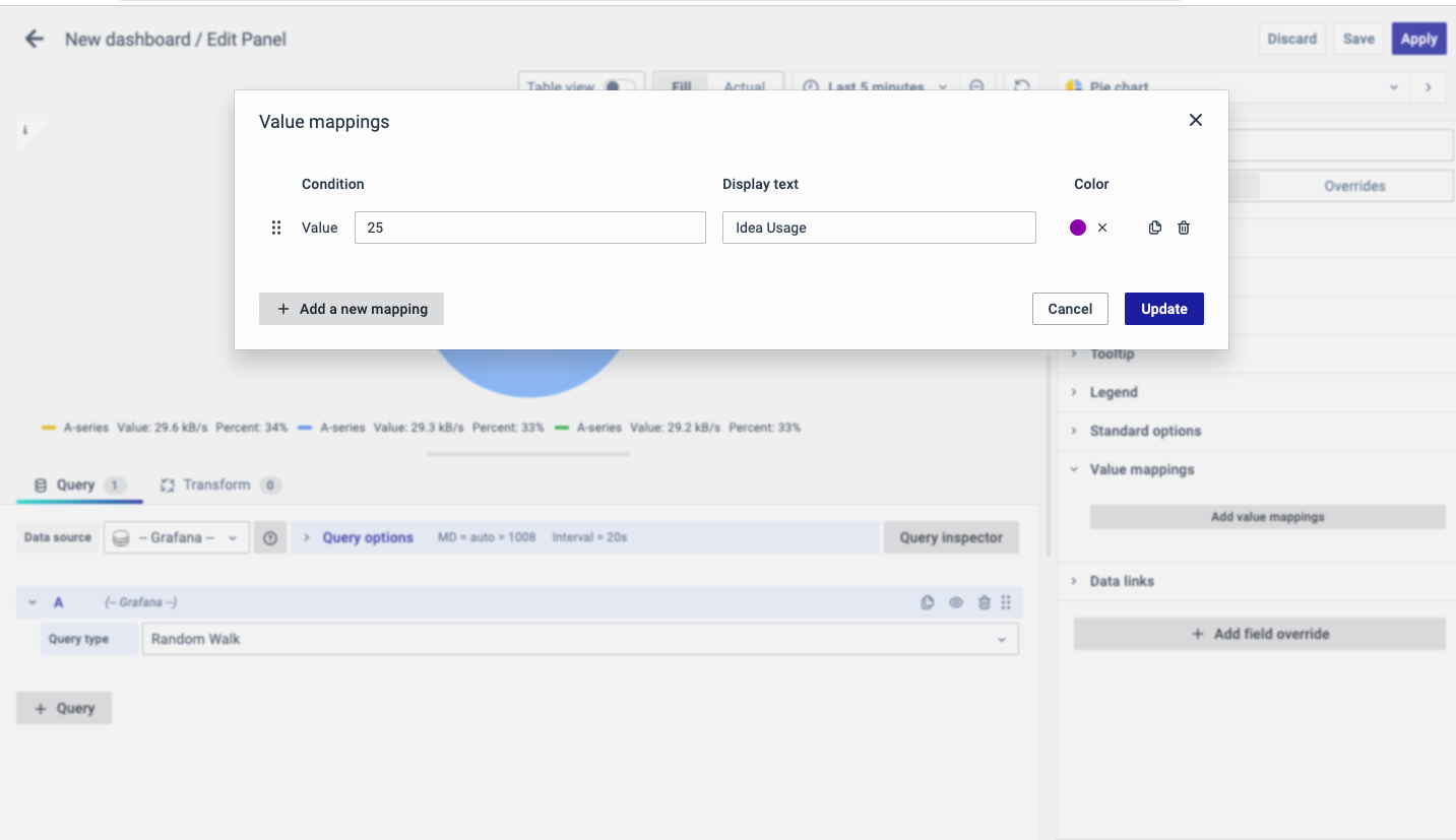
Value Mappings
The Value Mappings option allows you to find a specific value, and the display text is displayed wherever the value lies. If there is a similar value in the data, it is highlighted in the form of the color selected.
Data Links
The Data Links option is similar to the Panel Link where you can link a URL and then open it in another tab. It is placed on the data instead of the Panel.
You can click on the data anywhere and the link option will appear.
It is used for an instant link that you want to appear anytime you click on the data.
Add Field Override
The Add field Override option allows you to override an existing field.
Overrides allow you to change the settings for one or more fields. Field options for overrides are the same as the field options available in a particular visualization. The only difference is that you choose which fields to apply them to.
To add a field override, click on the Add Field Override button.
Select the Field type
Select a field type, based on the following properties:
-
Name: Set properties for a specific field with a name.
-
Matching Regex: Set properties for fields with name matching a regex.
-
Type: Set properties for a field of a specific type (number, string, boolean).
-
Query: Set properties from the field for a specific query.
- Select Field
- Select the override property
- Configure the override property
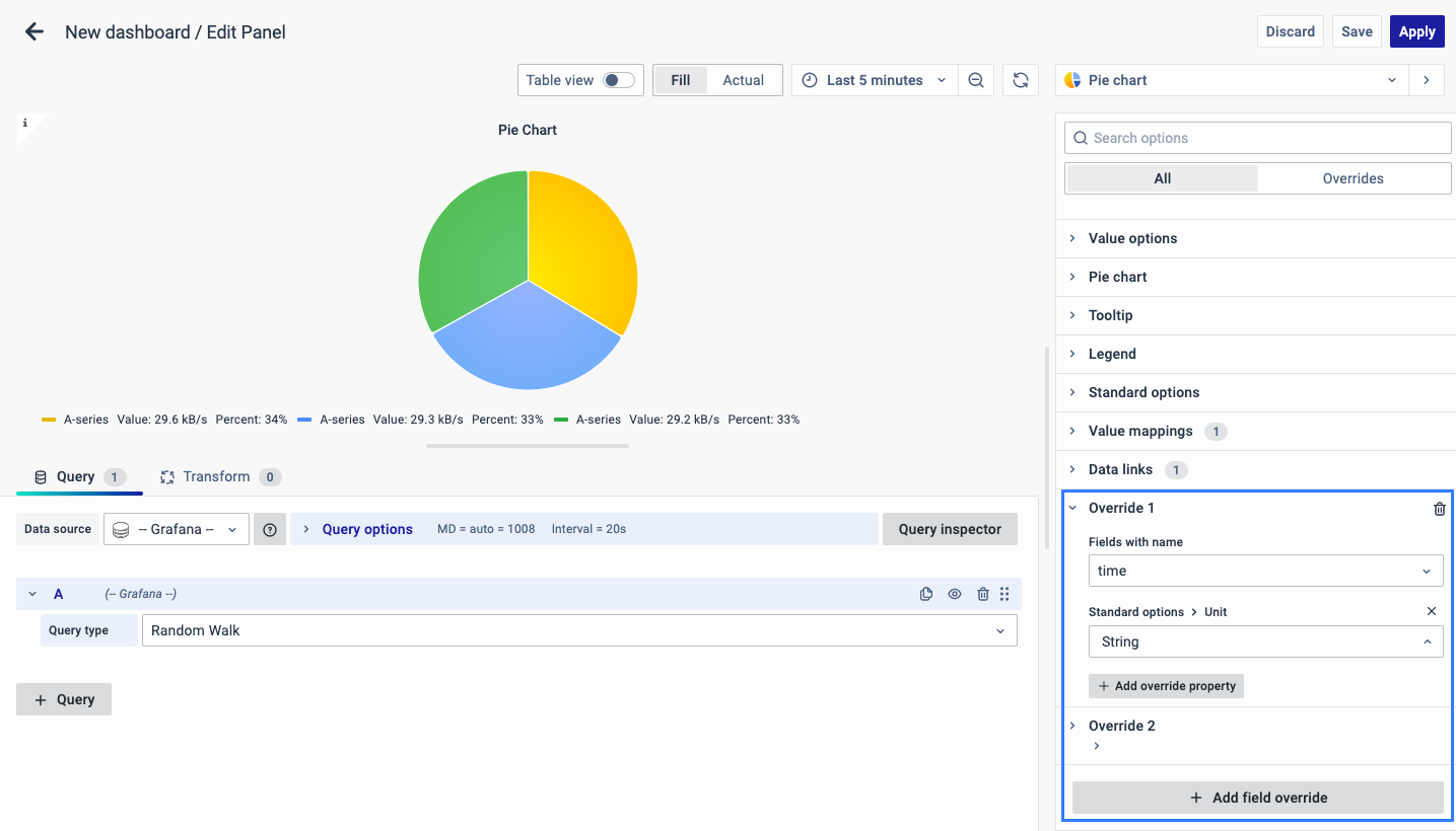
You can add multiple fields overrides by repeating the same.
You have now learned how to configure the Pie Chart, change the panel settings, and more. You can save and edit the panel later too.
FAQs
What is a pie chart, and when should I use it?
A pie chart is a circular statistical graphic that represents data in slices, where each slice is proportional to the value it represents.
- Best for illustrating percentages or proportional data.
- Recommended for five categories or fewer for better readability.
- For more details, see Pie Chart.
How do I create a pie chart in the dashboard?
- Create a new dashboard panel.
- Configure the query with the appropriate data source.
- Select Pie Chart as the visualization type.
- See Creating a Pie Chart for detailed steps.
How can I add a description to my pie chart panel?
- Go to Panel Options.
- Enter a name and description for the panel.
- Helps in identifying the purpose, e.g., "Power Usage" for tracking power consumption.
- Check Panel Options for more information.
What are the options for displaying values in the pie chart?
- You can choose to show calculated values, all values, or limit the number of displayed values. Additionally, you can select specific fields to display.
- More details are in Value Options.
How do I customize the labels on my pie chart?
- You can choose to display different types of labels such as series names, percentages, and raw numerical values.
- See Pie Chart Labels for further details.
How can I add a link to another dashboard or website from my pie chart panel?
- Use Panel Link in Panel Options.
- Add a title, URL, and configure it to open in a new tab if needed.
- For instructions, refer to Panel Link.
What is the tooltip feature, and how can I configure it?
- Tooltip shows data when hovering over the pie chart.
- Set it to single, all, or hidden mode.
- Learn more in Tooltip.
How do I adjust the legend settings in my pie chart?
- The legend can be displayed at the bottom or right and in list, table, or hidden mode. You can also choose which values to show in the legend.
- See Legend for detailed options.
What are field overrides, and how do I use them?
- Field overrides allow modifying settings for specific fields.
- Apply overrides based on field names, regex matches, field types, or specific queries.
- For step-by-step instructions, see Field Override.
Why is my pie chart not displaying any data?
- Check if the query is correctly configured.
- Ensure the data source is appropriately selected.
- Verify the minimum and maximum value settings.
- Ensure that data is available within the specified range.
How do I handle missing or null values in my pie chart data?
- Use the No Value option in Standard Options.
- Specify what should be displayed when there is no data available.
- More details are available in Standard Options.
